New Work Cadence & Eli
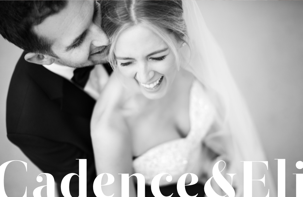
Cadence & Eli are a husband and wife photography duo located in Minneapolis, MN. They came to us earlier this year for a full on rebrand and together, we aimed to create a balance between their appreciation of classic simplicity and unexpected creativity. Seriously, though ... if you look at their work, you'll understand exactly what I'm talking about. And then below, I'll walk through our design process and share everything that's been created thus far!
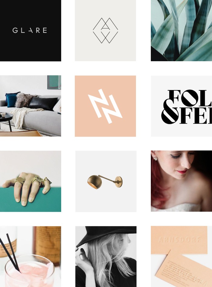
First up, we created an in-depth brand strategy for Cadence & Eli that focused on their passion, purpose, target market, and competition, as well as how they stand out within the Minneapolis photography industry. The biggest takeaway here was two fold. First, they are a husband and wife duo, which establishes a strong partnership and a bigger "team" than what's typically expected. And second, they have an amazingly unique eye for color, composition, and story telling. All of their work feels completely genuine and unlike anything I've seen locally.
Keeping all of this in mind, we decided to use classic typography as a base in order to appear professional and appeal to a higher end market. And ultimately, when paired next to their creative imagery (like this!!), that all too important balance of who they are and what they make would be established.
Once the moodboard was approved, we began developing several design concepts over the course of one week. Then, during the second week, we took the strongest two solutions and continued to refine until they were both ready for presentation. We were left with a battle between sans serif + serif type, and although BOTH are classic, they each gave off a different vibe. The sans serif option felt clean and modern, while the serif felt welcoming. Here are some of those initial explorations:
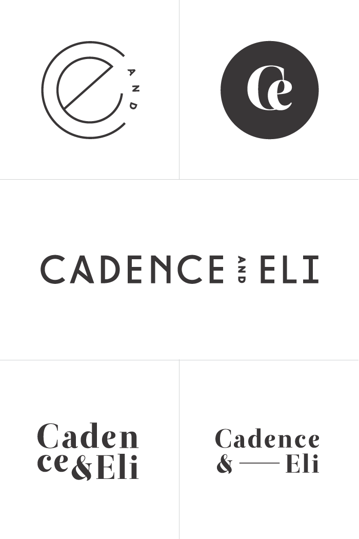
Although we were all quite obsessed with that top left mark, we were equally sure that sans serif typography was NOT the best way to move forward. It just felt a little too modern. The serif type, on the other hand, had this bold (and edgy!) energy to it that perfectly reflected Cadence & Eli's personalities. So that's exactly how we decided to move forward. Revisions were minor and included tightening up the type and exploring a few alternative (yet still simple) compositions. Below, you'll see where we ended up:
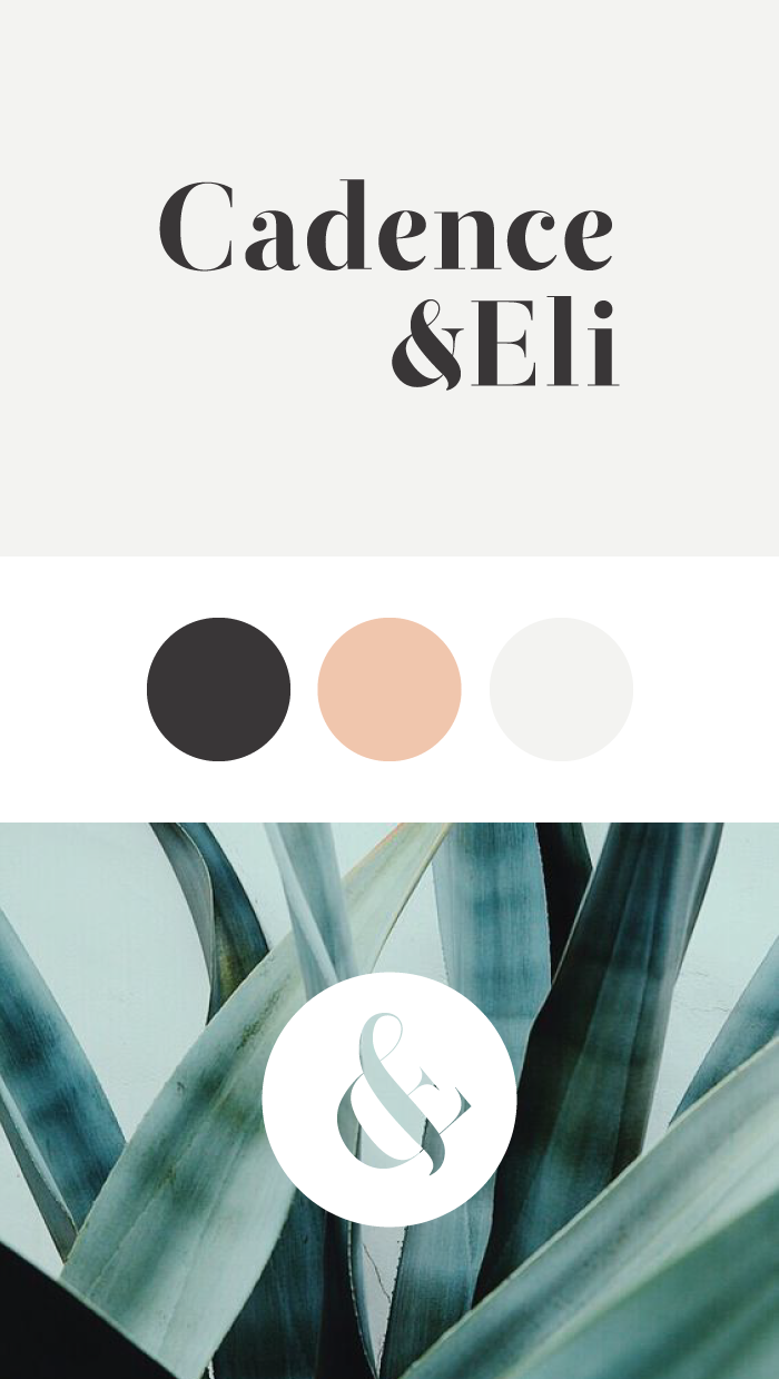
The above mark is very conceptual, and something that we all figured out together. At first glance, it looks like the ampersand from their logo. This is great for consistency, but also because they are a husband AND wife duo. ;) But once you look a little closer, you'll notice that the ampersand is carefully composed from the letter "C" and "E" for each of their initials. Sneaky, but wonderful.
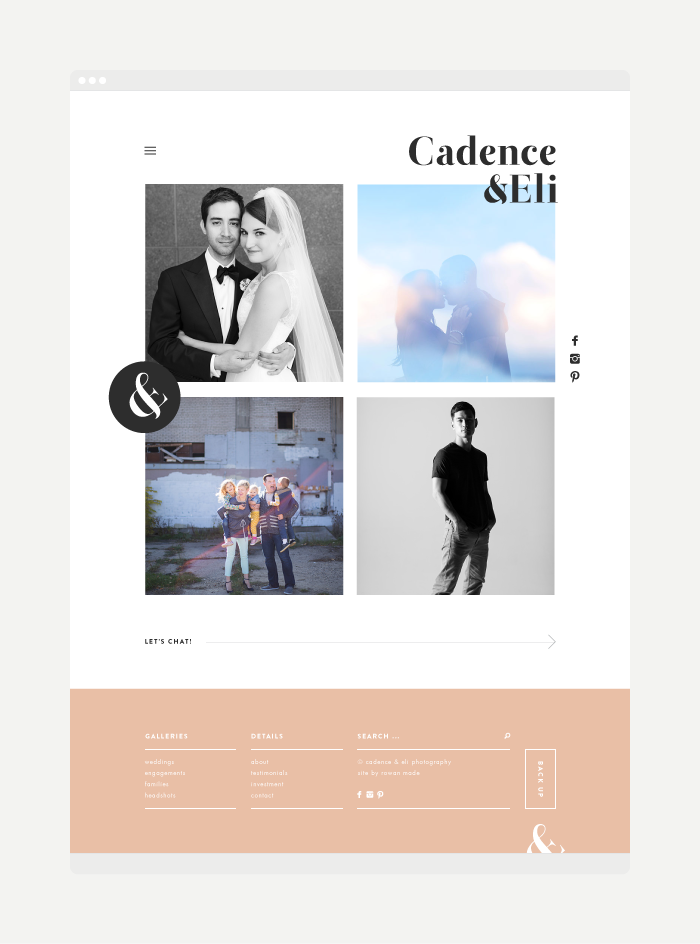
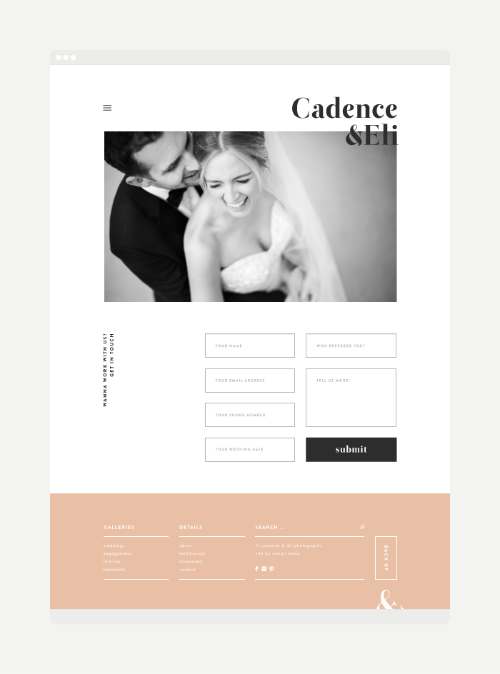
With everything official, we then moved on to creating a website. The focal point of this website is their imagery, of course, but it was seriously fun to play around with a right aligned logo (which is uncommon) and figure out how to still achieve some sort of balance in layout. Rather than talk too much about it, you can click through the website right here, or check out a few screenshots below:
So there you have it, a new look for Cadence & Eli! We also designed a beautiful pricing booklet for them that I have yet to photograph. But as soon as I do, you'll be the first to see. Promise.