New Work For Loveleaf Co
Earlier this year, I had the opportunity to design for an up and coming business with a mission of bringing simplicity and intentionality to the table, one salad at a time. The founder, Ally, came to me with a strong strategy already in place and I instantly knew that we'd be a good fit based on their needs and her attention to detail + timeliness. Strong relationships do truly make a project collaboration that much better and below, you'll see where we ended up:
After reading more into the brand strategy + positioning for Loveleaf Co, it was clear that they wanted to establish an authoritative voice in the already saturated slow + healthy lifestyle movement. But instead of sharing a fancy, complicated, or shiny new strategy, they wanted to be refreshingly simple. Their motto is to "eat one salad a day" after all. ;) I loved this fresh (and clear) approach and knew that we needed to keep things clean and refined to reflect their entire belief system. So! We came up with a moodboard to visualize just that.

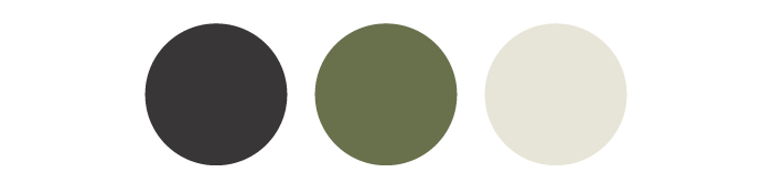
As you can see, there is a delicate balance of thin + script typography in order to mix their personable nature with something that feels both professional and trustworthy. Their palette stays relatively neutral with a more obvious pop of green (this is a salad base business after all). And the overall vibe is very clean and simple to reflect their mission! Once everything was approved, I dove into initial design development, some of which can be seen below.

As I continued working, the concepts naturally divided themselves into two directions: leaning more towards script OR sans serif typography. But in the end, both Ally and myself decided that the sans serif type represented their (simple) mission better, but we still wanted to somehow incorporate an approachable feel.
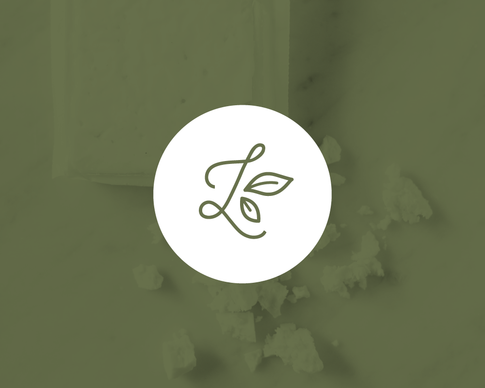
In order to get there, I placed the flowy (but still simple) leaf design that Ally liked above the "V" in Loveleaf to achieve that delicate balance. We also decided to use a script "L" for her circular mark with two leaves filling the open space so they could tie back to the primary logo for consistency. Below, you'll see an overview of the final Loveleaf Co. branding suite!


In the future (hopefully really soon!), Ally and I plan to collaborate again on a fully customized website as she continues to grow her business from the ground up. You can see her current website and learn more about what Loveleaf Co. is all about right here! Who knows, their offerings may be right up your alley. ;)