New Work: The 24 East Blog
A few months ago, I received an email from Celine Magtaggart, a fourth-generation East Bay (CA) resident that wanted to shine light on all of the good things happening in her community. So! 24 East was born. This space "shines a bright spotlight on local businesses and products, highlights nonprofit causes and programs, and showcases local design and style." But before the website could launch, we needed to start from scratch and work through the branding + web design process ...
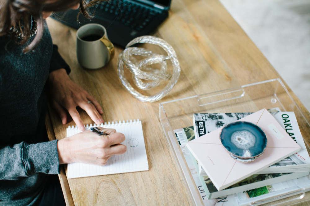
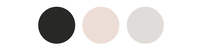
We started with a brand strategy and moodboard, shown below. The visuals we pulled were both modern and simple, but introduced subtle feminine elements (like pink and gold) that we planned to use sparingly throughout brand usage.

After the moodboard was approved, I dove head first into concept development, which typically takes me about two weeks for small business clients. But! We were on a rush, so everything you are about to see (that's branding related) was created, refined, and finalized within a one week period. This isn't something I like to do often, so it was quite the rush getting everything put together. During this time, I focused on sans serif AND serif typography, since we wanted something that was classic. But despite that, we still wanted some sort of edge. A je ne sais quoi as I like to call it.
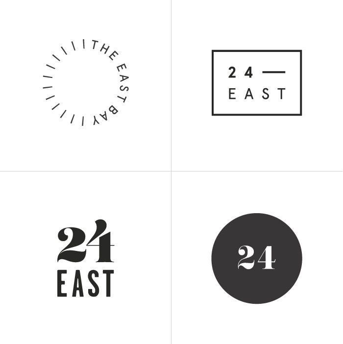
The top row (above) features sans serif typography as well as one of my favorite marks ideas, the east bay sun ray. Earlier on, Celine had told me about how gloomy San Francisco can be at times, and how the East Bay tends to be sunnier. And that's where the idea was born! The words "the east bay" sit on the east side of the circle, geographically correct. Then, the left side features a modern take on the sun, playing off of the East Bay's sunnier weather. Celine was instantly drawn to this concept and we worked from there.
Needless to say, we took the sans serif route, but made a few changes. First, the text in her mark needed to be a bit more bold so that it didn't get lost in the sun ray illustration (and was easier to read). We also wanted to simplify her primary logo so that everything was on one line and a bit cleaner. After a few tweaks, the 24 East brand was finalized and ready to go.


Next, we moved onto web design! We knew that we wanted something editorial and layered. Something unique, yet easy to navigate. I went outside of my box a little bit on this one, and started stacking elements like crazy, then went back to simplify and edit down. ;) We ended up with a very dynamic layout that I'm super excited to share with you all as I think it helps bring a certain edge to this modern brand.
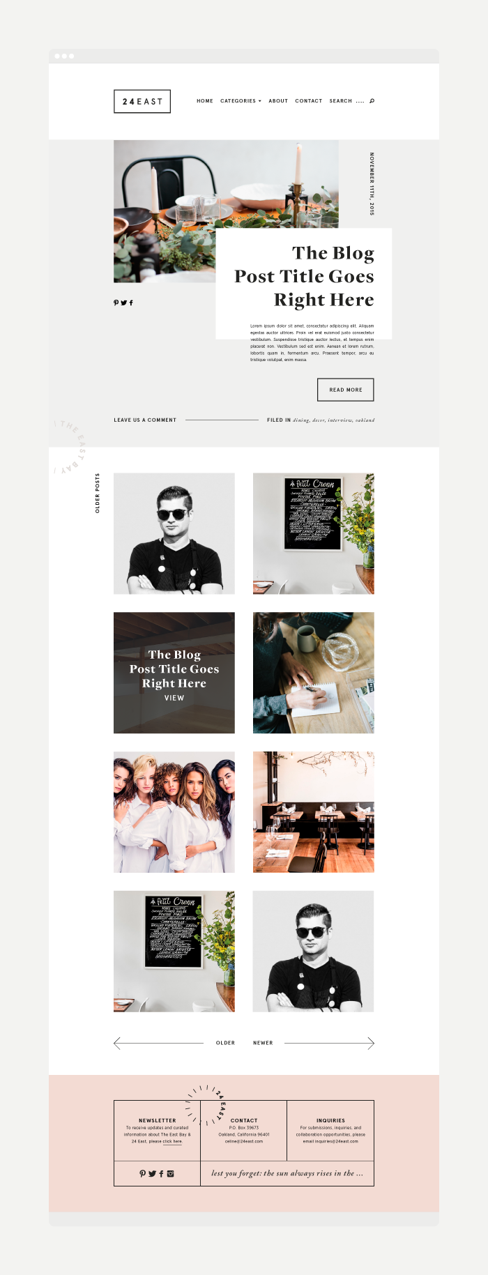
You can view the entire site live right here. And a huge thank you goes out to Janine Isabelle for the development on this one! We actually also worked on collateral materials and have even more projects in queue, so I'll be sure to share more once everything is ready.
PS. Celine (the founder of 24 East) actually chatted about the design process from her perspective and interviewed me about our collaboration and my life as a designer. You can read that right here.